Roofr: 2022-Present
🎨 Design System
🧑🔬 Research Takeaways
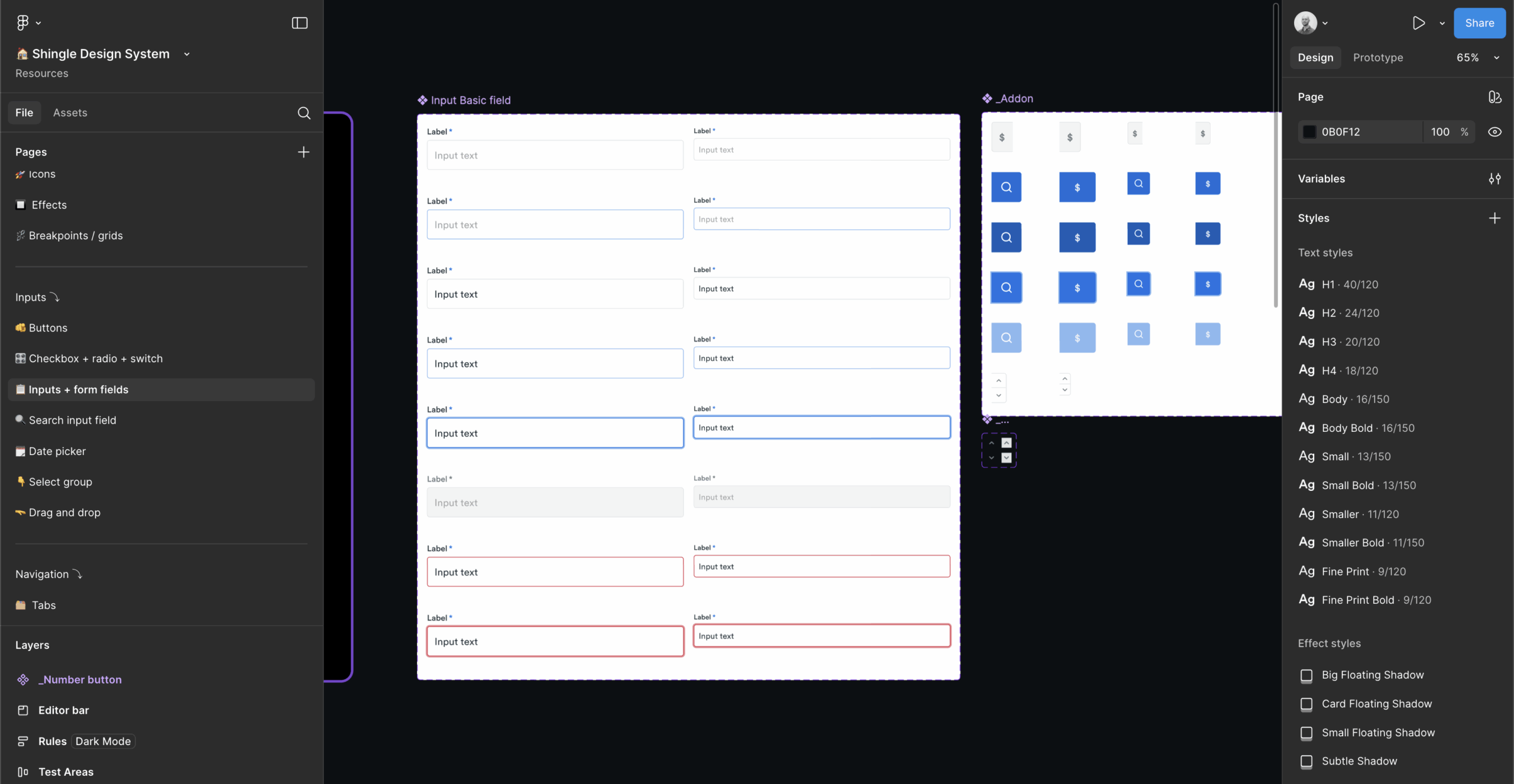
I conducted a comprehensive audit of our existing Roofr interface to identify the most frequently used UI elements and inconsistencies across our platform. Through design team meetings, I mapped our primary workflow needs and component usage frequency to prioritize which foundational elements were the most important. Analysis of our current design files revealed that buttons, form inputs, typography, and color applications were being recreated constantly with slight variations, creating both design debt and engineering complexity.
While I referenced established design systems for best practices, the primary research focused on understanding our team’s specific needs and usage patterns.
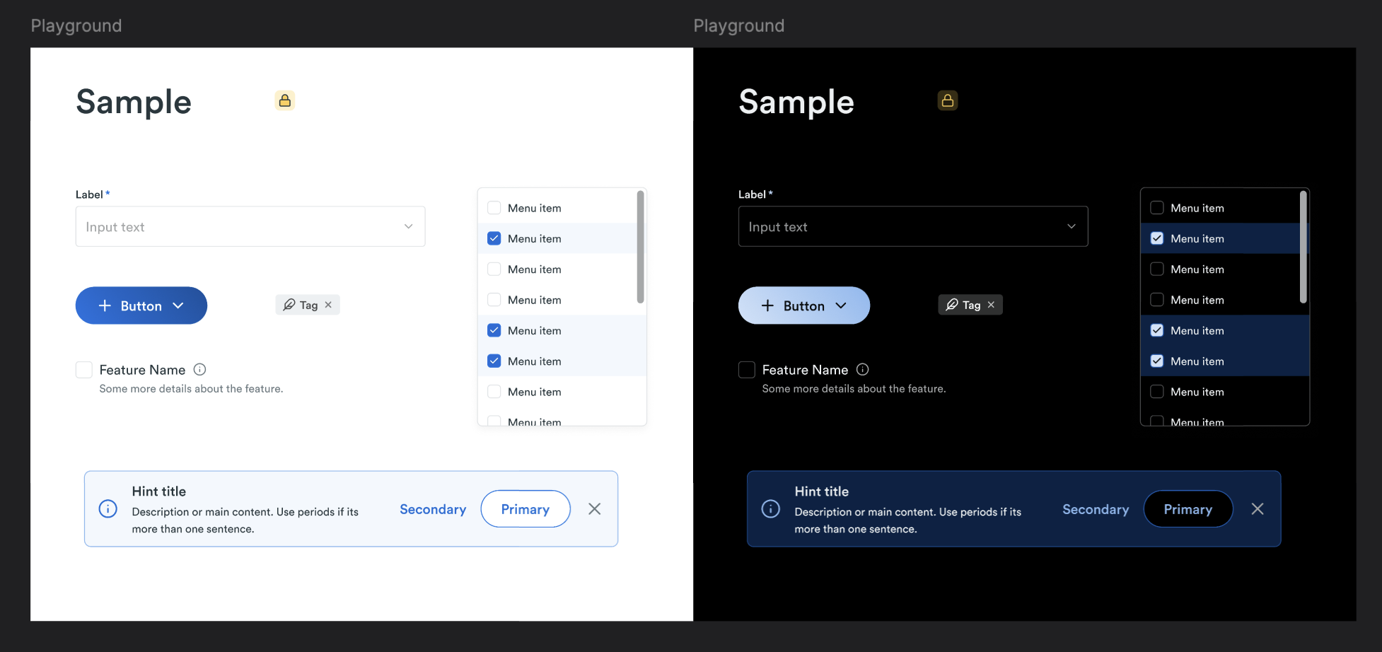
Component Preview
Usage & Analytics
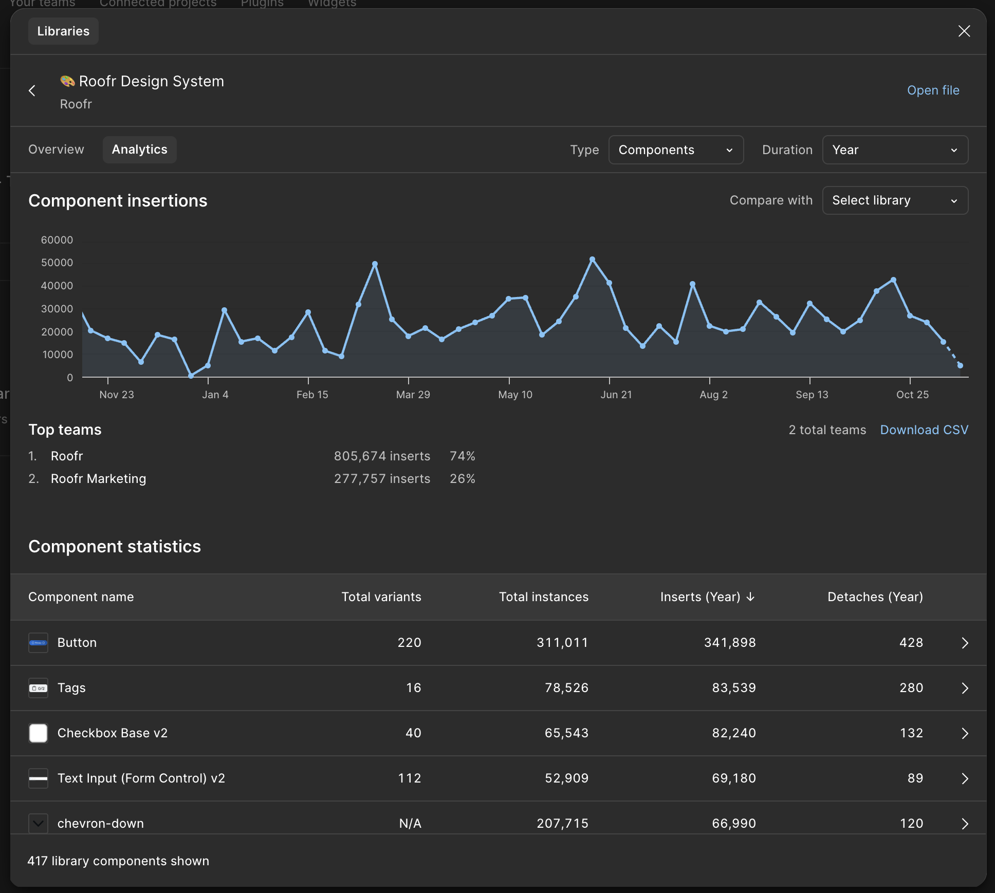
📈 Learnings and Performance
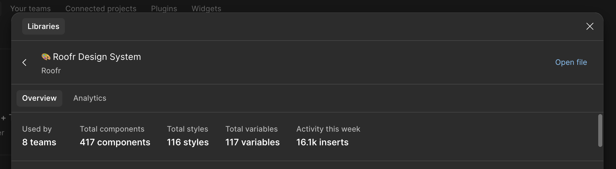
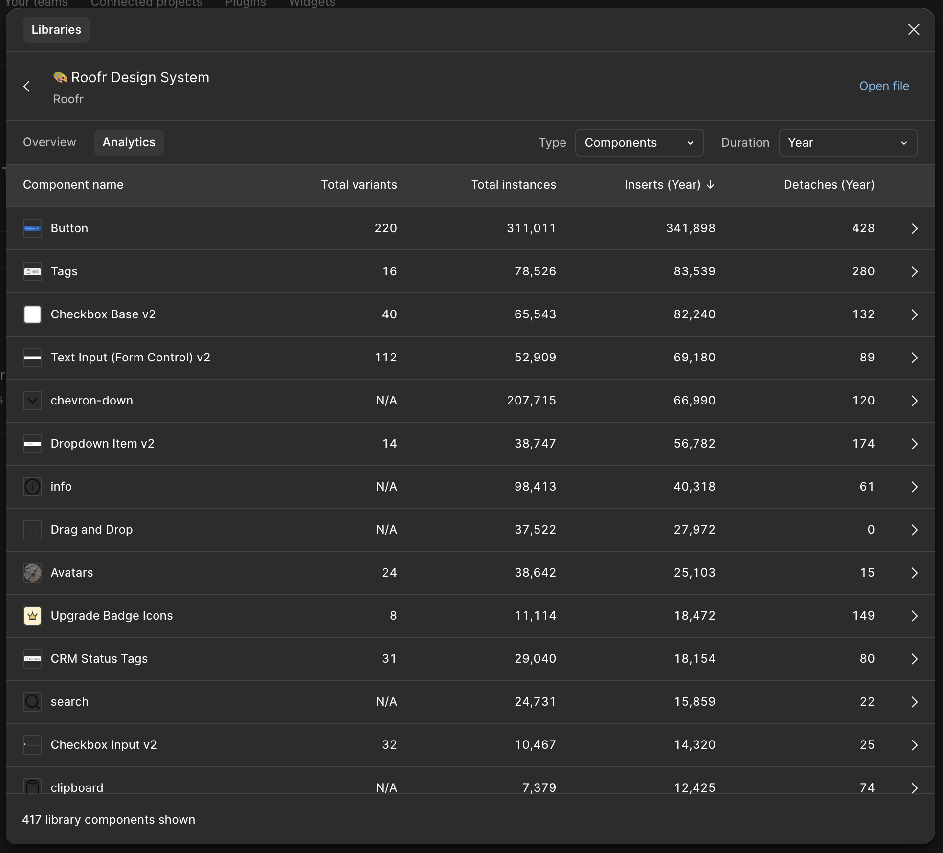
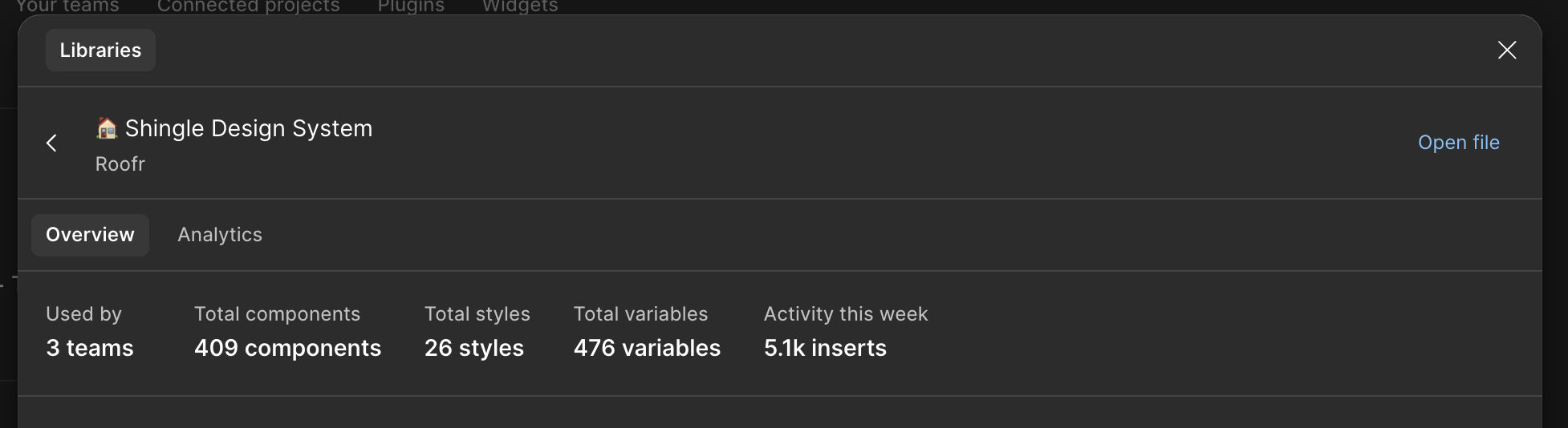
The design system exceeded all adoption expectations. We ended up with 400+ components (keep in mind each icon is also a component) with sustained high usage across the organization. Analytics show 20,000+ weekly component insertions with consistent adoption patterns and infrequent detaching. This is demonstrating how the system became integral to daily workflows rather than optional tooling.
Team Usage
The Roofr team (representing the product designers) is the vast majority of usage, and surprisingly even the Roofr Marketing team (representing the social, graphic, and brand designers) adopted the system with meaningful usage, validating its value beyond core product development.
Components
Individual component performance revealed strategic wins: the Button component alone generated 341,898 yearly insertions across 220 variants, while foundational elements like Tags (83,539 insertions) and Checkboxes (82,240 insertions) proved the core component strategy was sound. The system’s success enabled our recent variable-based rebuild, which now supports instant dark mode switching across all 400+ components with zero additional design work required.
Developer Impact
Front-end developers reported significantly improved consistency in implementation, and the cross-team adoption (including marketing usage) demonstrated the system’s value extended beyond its original product team scope. This work fundamentally shifted our organization from component recreation to systematic design thinking, with the analytics proving the system became essential infrastructure rather than a nice-to-have resource.
Challenges
The biggest challenge was decided which components to focus our effort on while ensuring quality. With the data showing sustained adoption patterns over time it gave the justification to dedicate the entire teams resources towards it to create the newly launched v2 version.